Big Red Gear.
Navigation, rebuilt.

Big Red Gear sells LED driving lights and 4×4 gear in Australia on the Impulse theme. We built a custom mega menu directly in theme code — a full-width black dropdown with category images, a large preview that changes on hover and a compact mobile version — plus a featured collections layout.

CLIENT
Big Red Gear
MARKET
Australia
PLATFORM
Shopify · Impulse 7.6.1
SCOPE
Mega menu, navigation, collection UI
APPROACH
Theme code, no app
Visit the live store ↗LIVE · CHECKED OCT 2026
bigredgear.com.au
Big Red Gear storefront built by Step-Media

RESULTS

6

Lighting categories, each with its own preview image

0

mega-menu apps — Liquid, CSS and JavaScript

2

separate layouts for desktop and mobile

THE BRIEF

One menu,
two screens.

Big Red Gear wanted a premium Lighting menu: full width, black, category images on the left and a big promotional image on the right that changes as you hover.

It had to live inside the existing Impulse header without replacing it, use the brand red #ba122b for hover states, lose the white boxes behind product images — and turn into a compact list on a phone.

IMPULSE 7.6.1#BA122BNO APP

WHAT WE BUILT

Built in the theme,
not bolted on.

A Liquid snippet rendered inside the Impulse header, laid out with Flexbox and media queries, with a few lines of JavaScript for the hover previews.

Full width, black, two columns

DESKTOP MEGA MENU

Full width, black, two columns

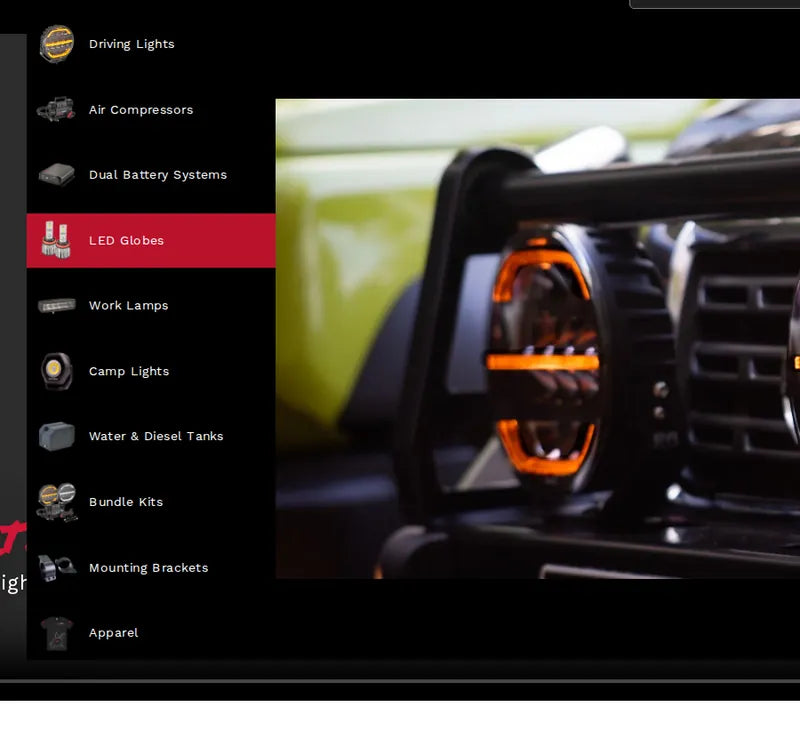
Category links with transparent product images on the left, a large promotional image on the right — and the dropdown spans the browser, not just the menu item. The same component now powers the store’s whole Shop menu.
HOVER PREVIEWS

A different image for every category

Each link carries its own data-image; JavaScript swaps the large preview on hover, so the client sets a promo image per category.

DRIVING LIGHTSLIGHT BARSLED GLOBESWORK LAMPSCAMP LIGHTSBRACKETS

BRAND RED

#ba122b on every hover

Hover and active states use the brand red on desktop and mobile, with no white boxes behind the product images.

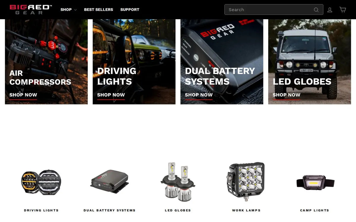
FEATURED COLLECTIONS

A 50 / 25 / 25 row

Three collection cards in one row on desktop — one large, two small — stacking on mobile, all editable in theme settings.

50%25%25%STACKS ON MOBILE
Compact, scannable, image-led

CATEGORY LIST

Compact, scannable, image-led

Reduced spacing, consistent category icons and tight columns, matched closely to the reference — the red state shows exactly where you are.

UNDER THE HOOD

Liquid, CSS and a little JavaScript

Snippet markup in the existing header, Flexbox for the two columns, media queries for mobile and collection URLs for every link.

LIQUID SNIPPETFLEXBOXMEDIA QUERIESVANILLA JS

MOBILE

Same menu,
thumb-sized.

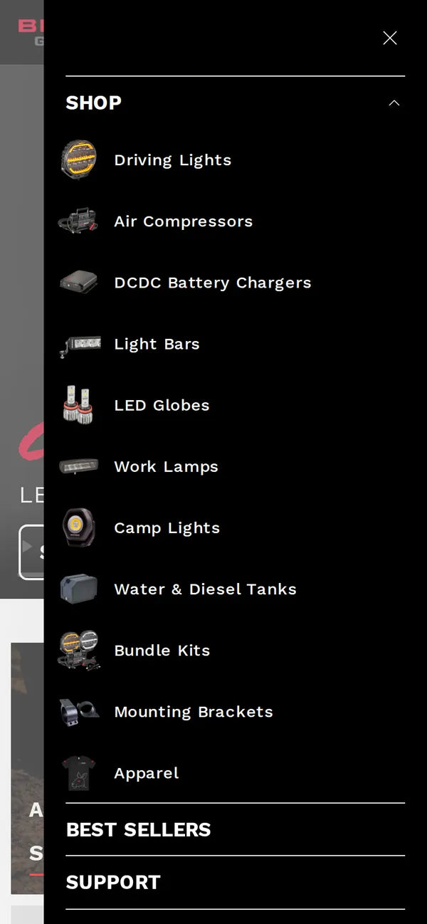
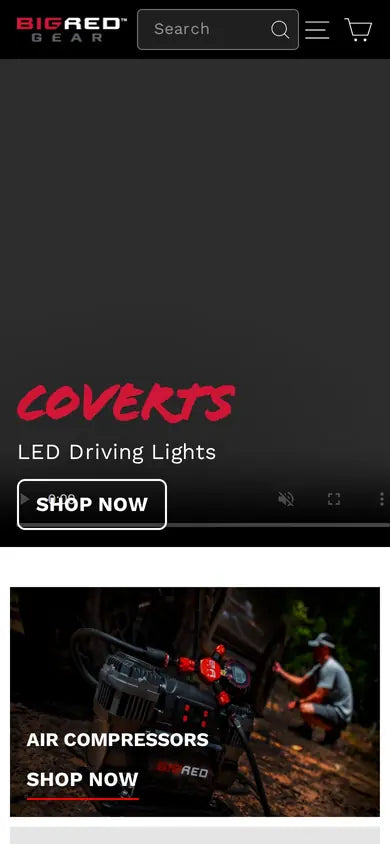
On mobile the large preview disappears; categories become a compact list with the image on the left and the name on the right, inside the existing drawer.

Same menu, — mobile

04 — WHO WORKED ON IT

Leanid LiabetskiDEVELOPER · NAVIGATION & THEMELeanid Liabetski

STACK

SHOPIFYIMPULSE 7.6.1LIQUID SNIPPETSCSS FLEXBOXJAVASCRIPTNO MEGA-MENU APP

NEXT CASE

Kennzeichenflink

Open the case →